This project challenged me to explore visual communication across paper and digital media. First, I started with hand-crafted paper iterations to experiment with texture, depth, and hierarchy, then transitioned these explorations into digital outputs. The final deliverables included a poster, flyer, social media graphic, landing page, and a brand sheet for an Andrew Lloyd Webber lecture.
Project Type
Graphic Design
Team
Solo!
My role
Designer
Timeline
October 2024 - December 2024
.png)
I kicked off the project by gathering images that captured the moods and themes tied to Andrew Lloyd Webber’s work, staying away from anything too obvious or literal. I then cut those images into abstract, unrecognizable shapes and started playing—layering, arranging, and experimenting by hand to explore texture, depth, hierarchy, and contrast.
After creating several different compositions, tweaking and testing as I went, I eventually landed on the one that felt the most dynamic and exciting to carry into the digital phase.
.png)


In this next phase, I brought my favorite paper composition into Adobe Illustrator, carefully translating its textures and shapes into a digital format. I used this digitized piece as a key visual element in designing the flyer for Andrew Lloyd Webber’s lecture. I went through two different iterations—the second focused on improving readability and achieving better visual balance. Throughout the process, I continued exploring contrast, hierarchy, and layering, aiming to create a layout that not only communicated key details like the location and date but also conveyed the lecture’s tone and subject matter through the overall visual composition.

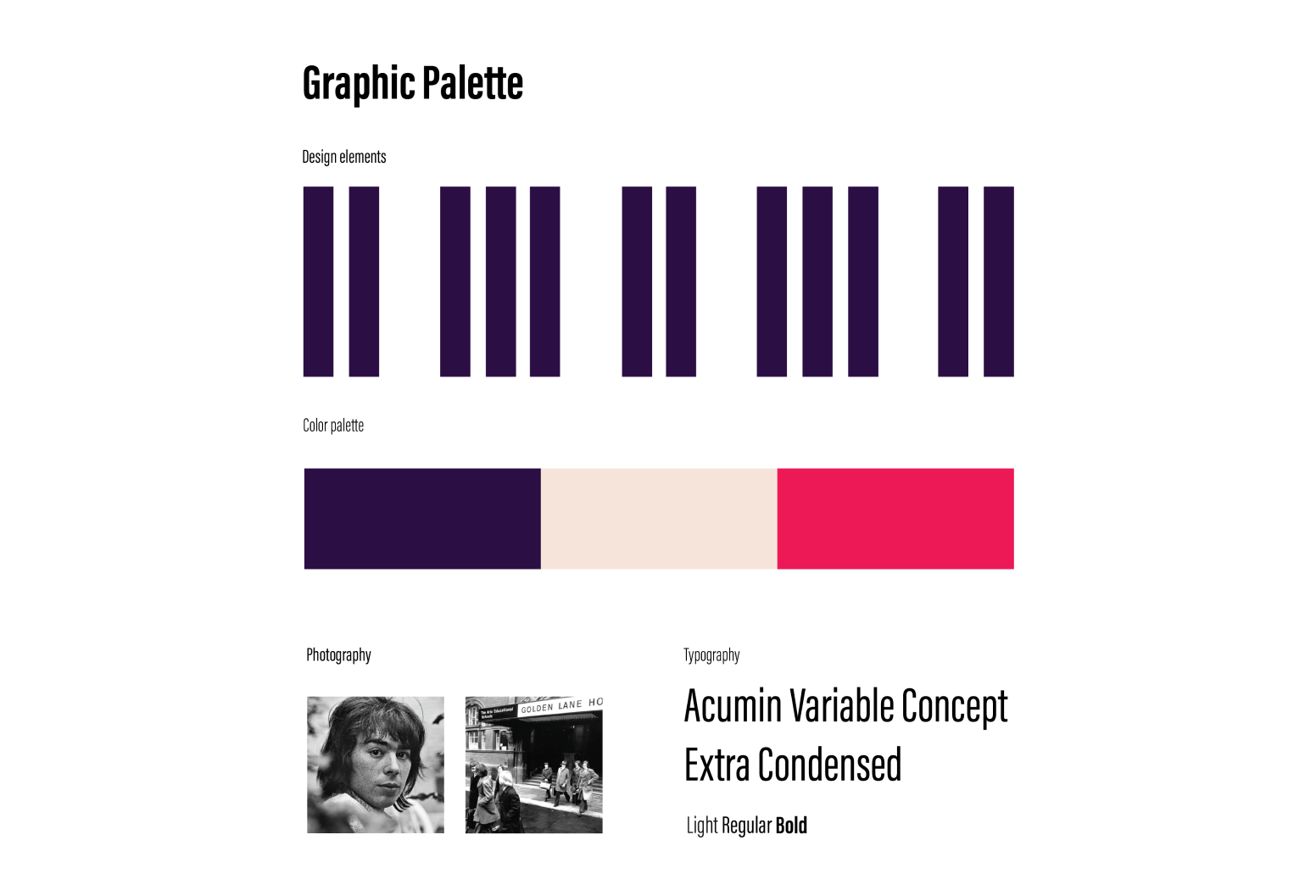
In the final phase, I moved fully into digital design to create the complete set of marketing materials for Andrew Lloyd Webber’s lecture. I developed a graphic palette to establish the colors, typography, and visual elements, creating a cohesive look across all pieces. I started with the flyer, incorporating an image of Andrew Lloyd Webber’s arts school and piano key motifs, while carefully aligning and placing the text to ensure the key information was clear and the viewer’s eye flowed smoothly across the composition. Once the flyer was complete, I adapted the design for social media and web, maintaining consistency while optimizing each format for its platform.

Moving from analog to digital pushed me to think outside the box and approach the design process in a more innovative way. Both mediums come with their own unique constraints, so it was both interesting and rewarding to figure out how to work creatively within them. Adapting my final flyer design into a social media post and web landing page challenged me to think critically about how to use new formats and spaces effectively — a constraint I didn’t have to consider as much in the earlier stages of the project.


